SWIFTKEY - Android app
aNDROID
role: UX/UI DESIGNER | JUN 2014 - DEC 2014
THE PROBLEM
SwiftKey was the number one replacement keyboard app on Android and is also available on iOS. As a UX Designer at SwiftKey my role was primarily focused on the existing Android keyboard, working closely with the development team to continue to improve the typing experience.
VISUALISING THE TYPING EXPERIENCE
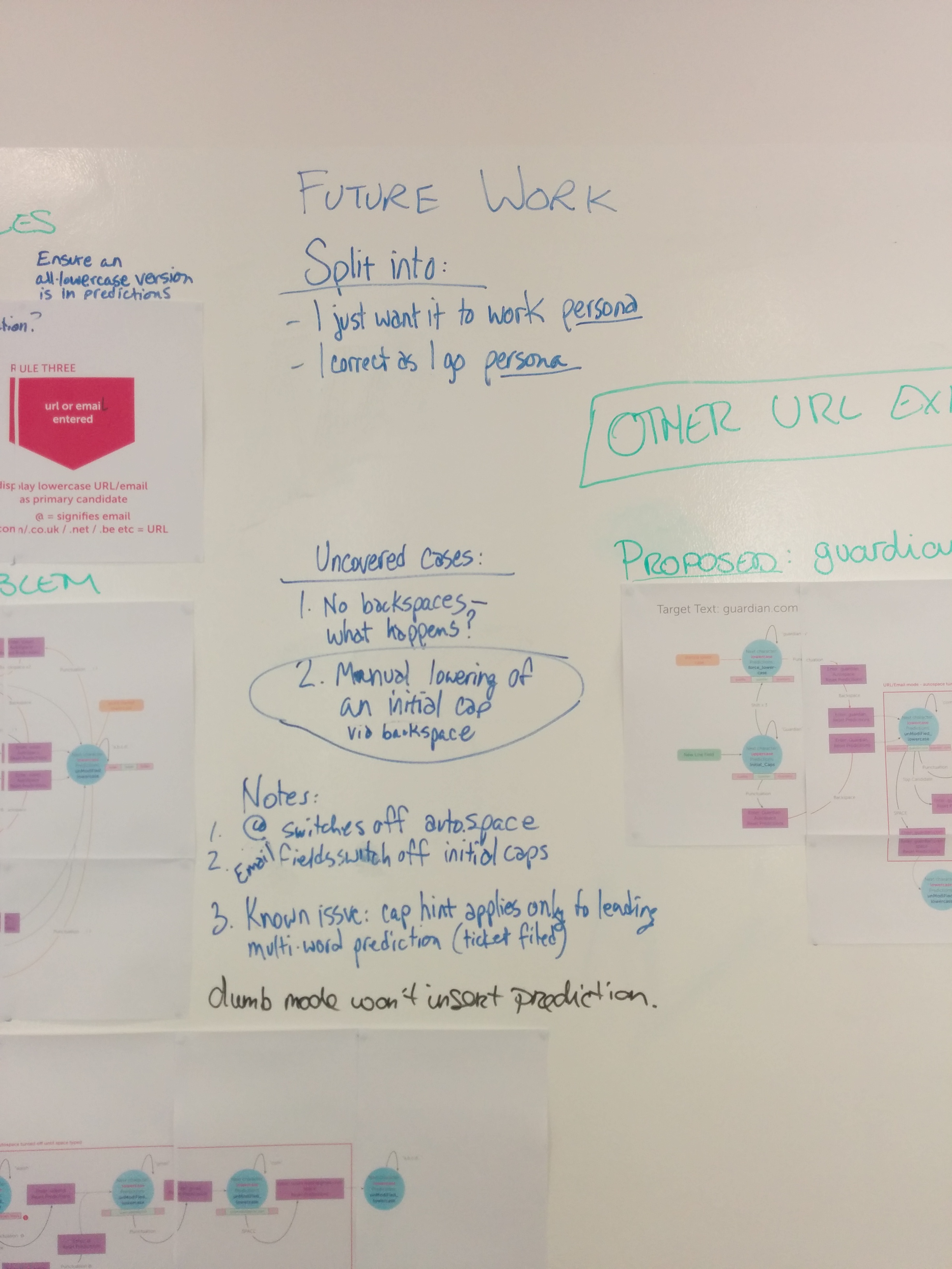
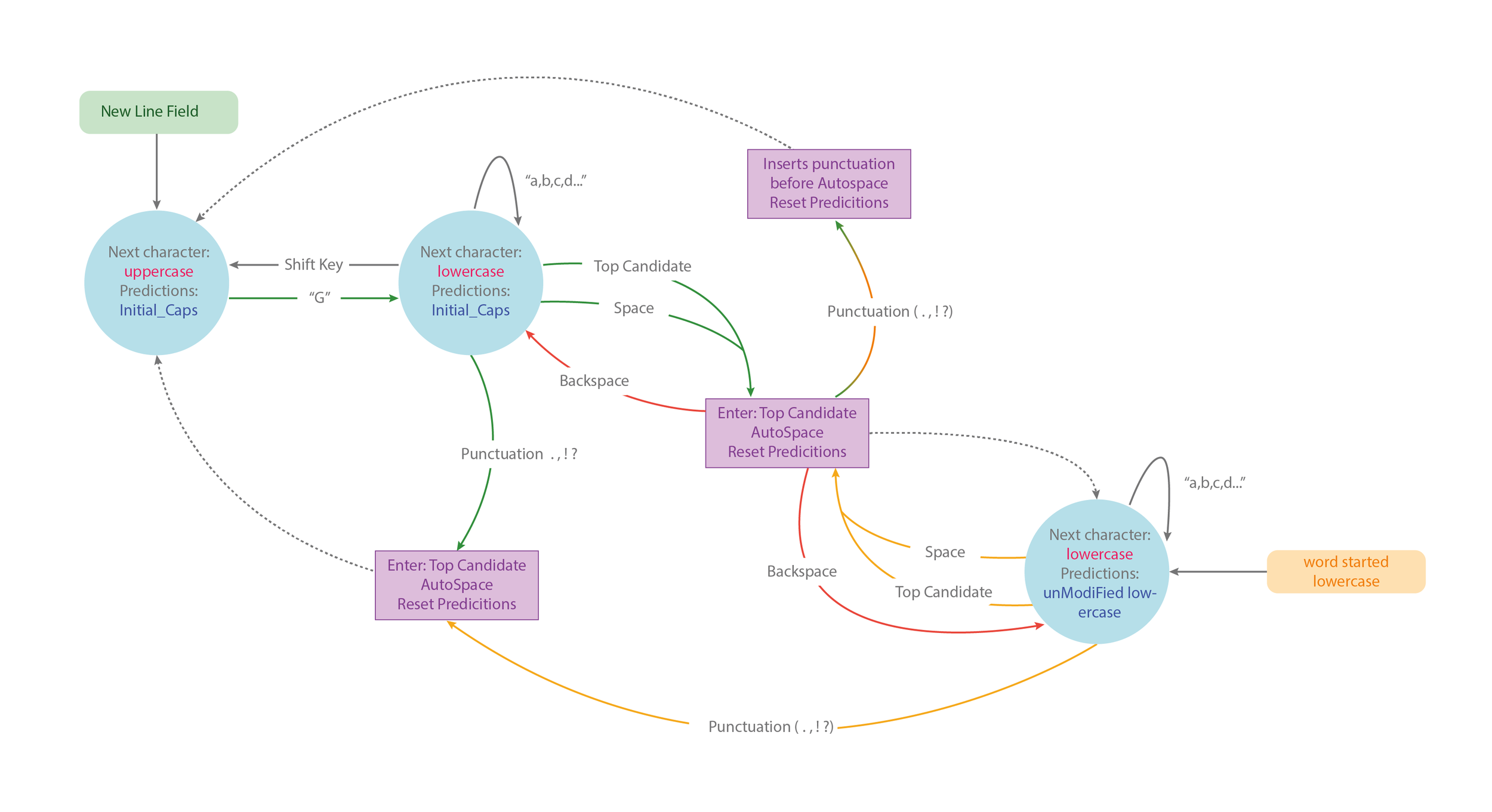
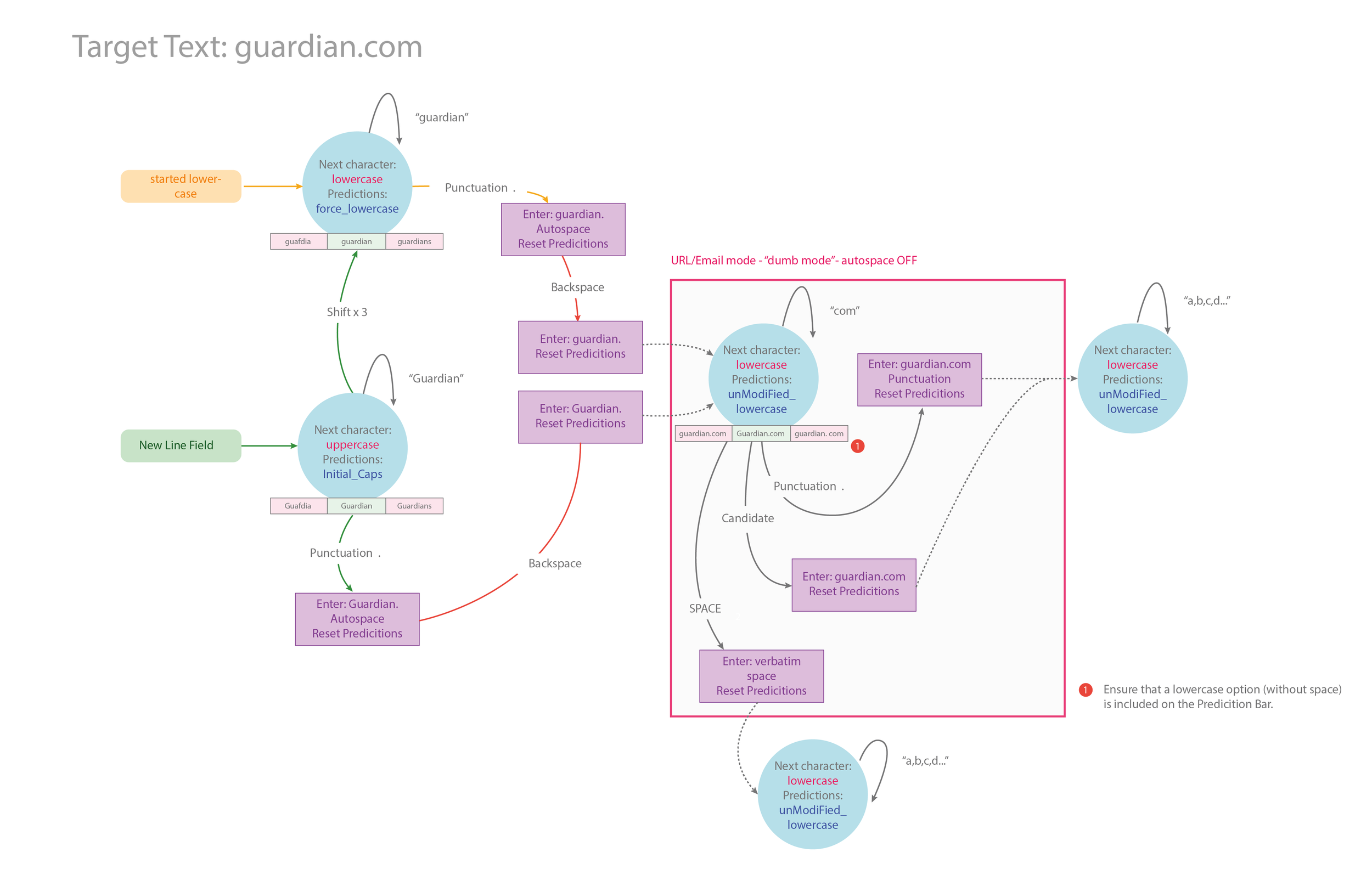
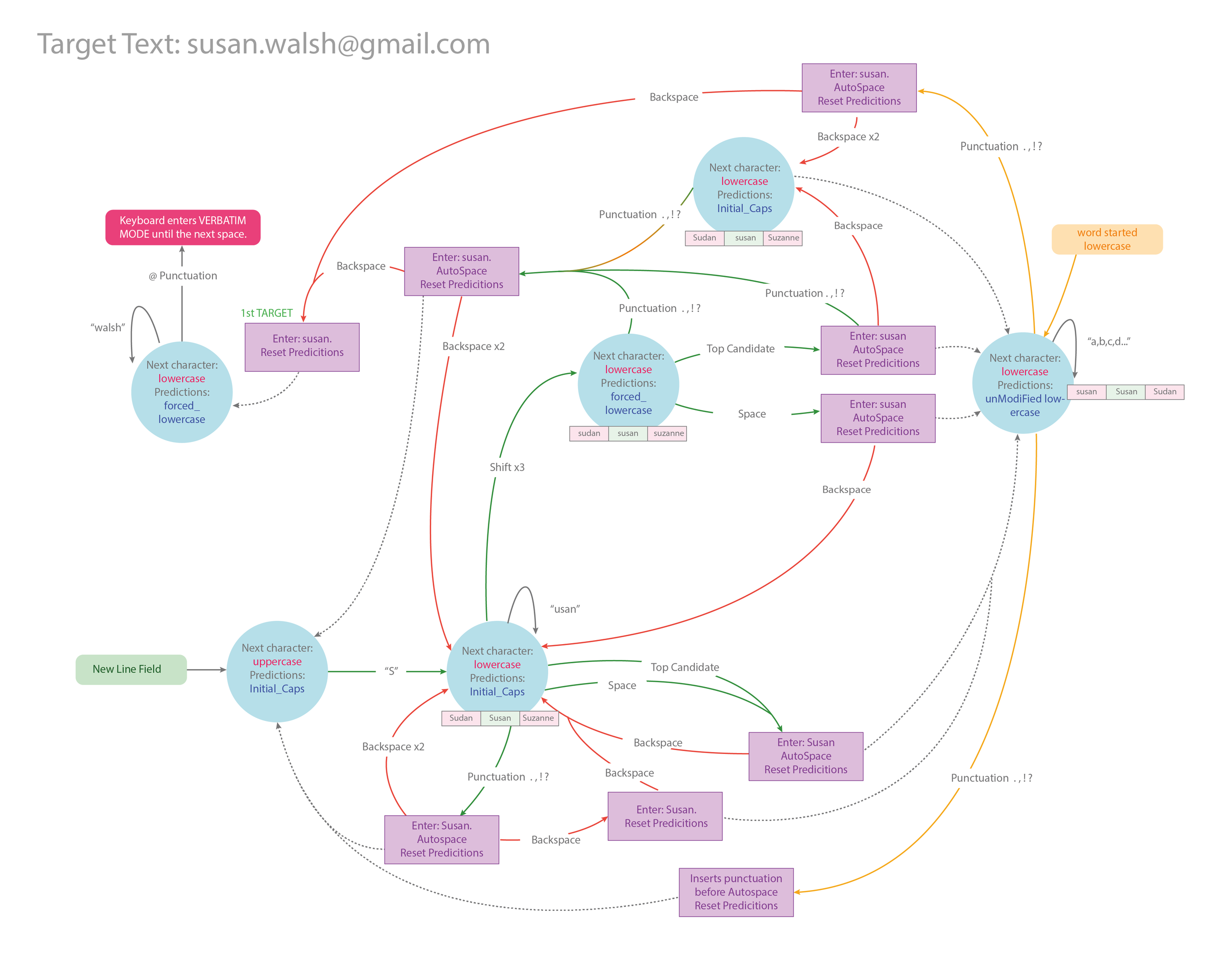
The majority of my role centred around mapping the keyboard behaviour - as it had never been visualised or mapped. This incorporated detailed analysis of known issues through system flow diagrams and documenting the complexities of the prediction and typing behaviour. The early stages of this were conducted on whiteboards, progressing to diagrams after discussion. I facilitated team workshops with representatives from product, development and UX, which enabled us to discuss the visualised problems, question proposed solutions and establish other areas of investigation that had been overlooked. This was a cyclical process which was repeated several times.
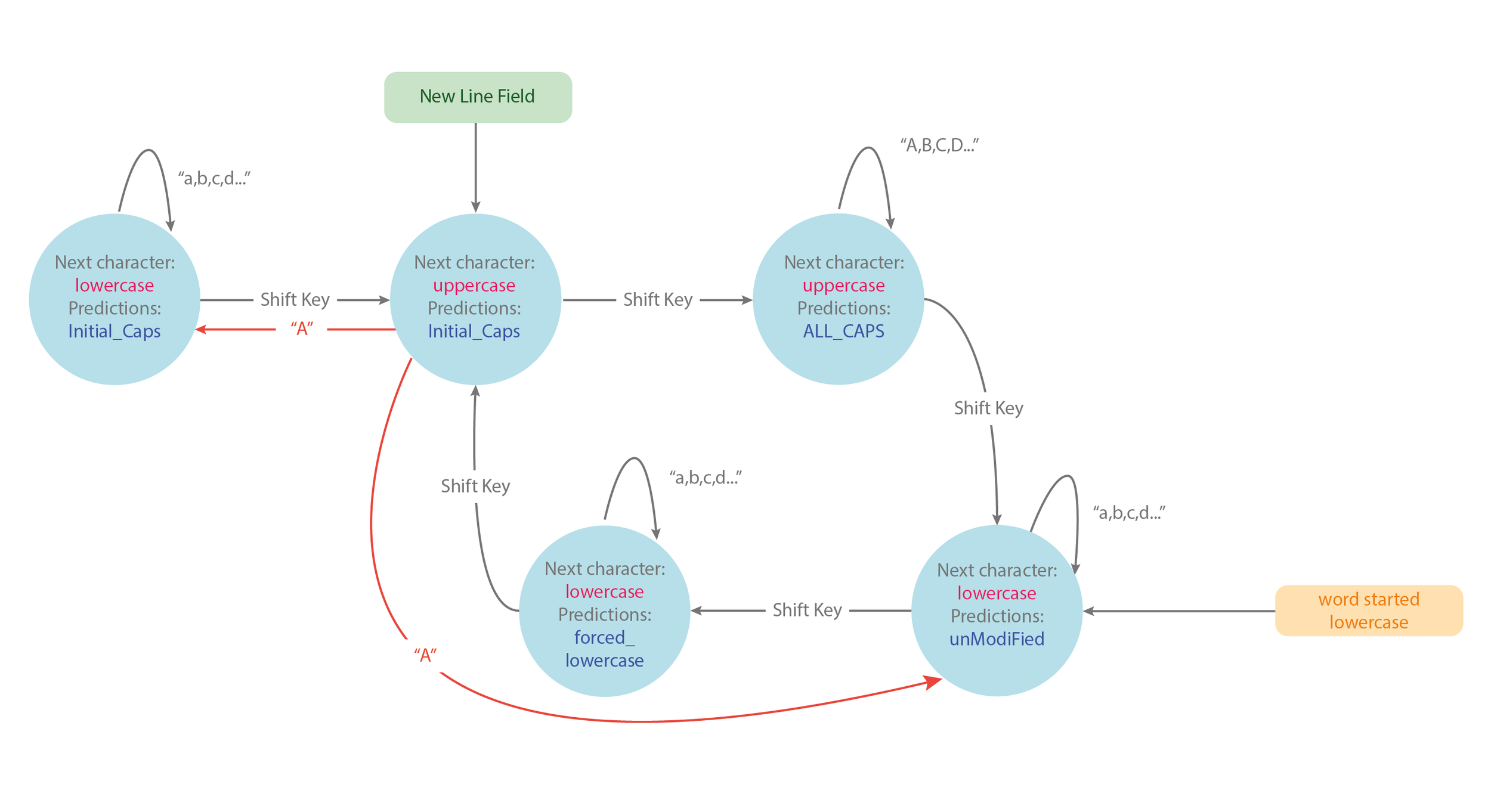
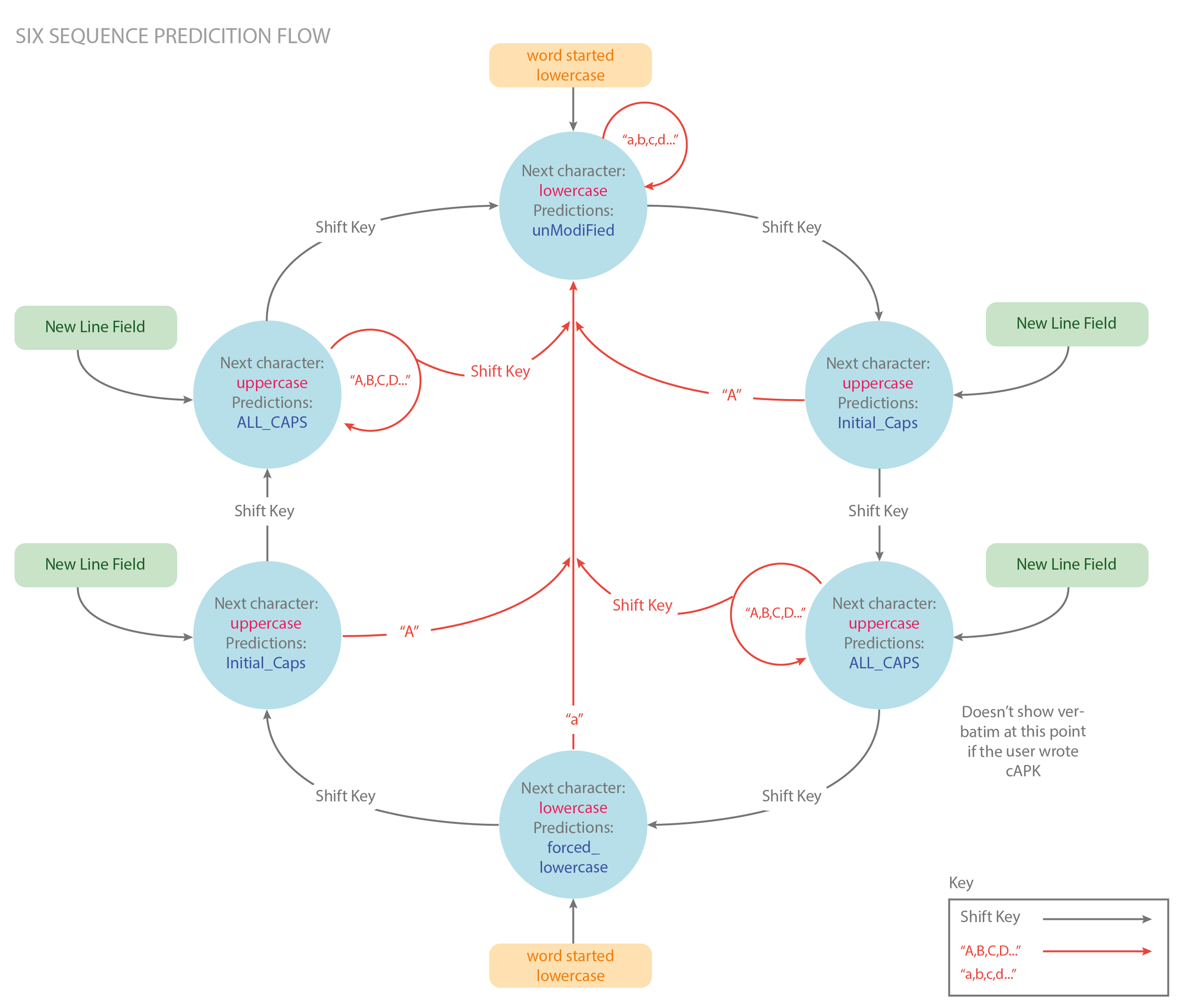
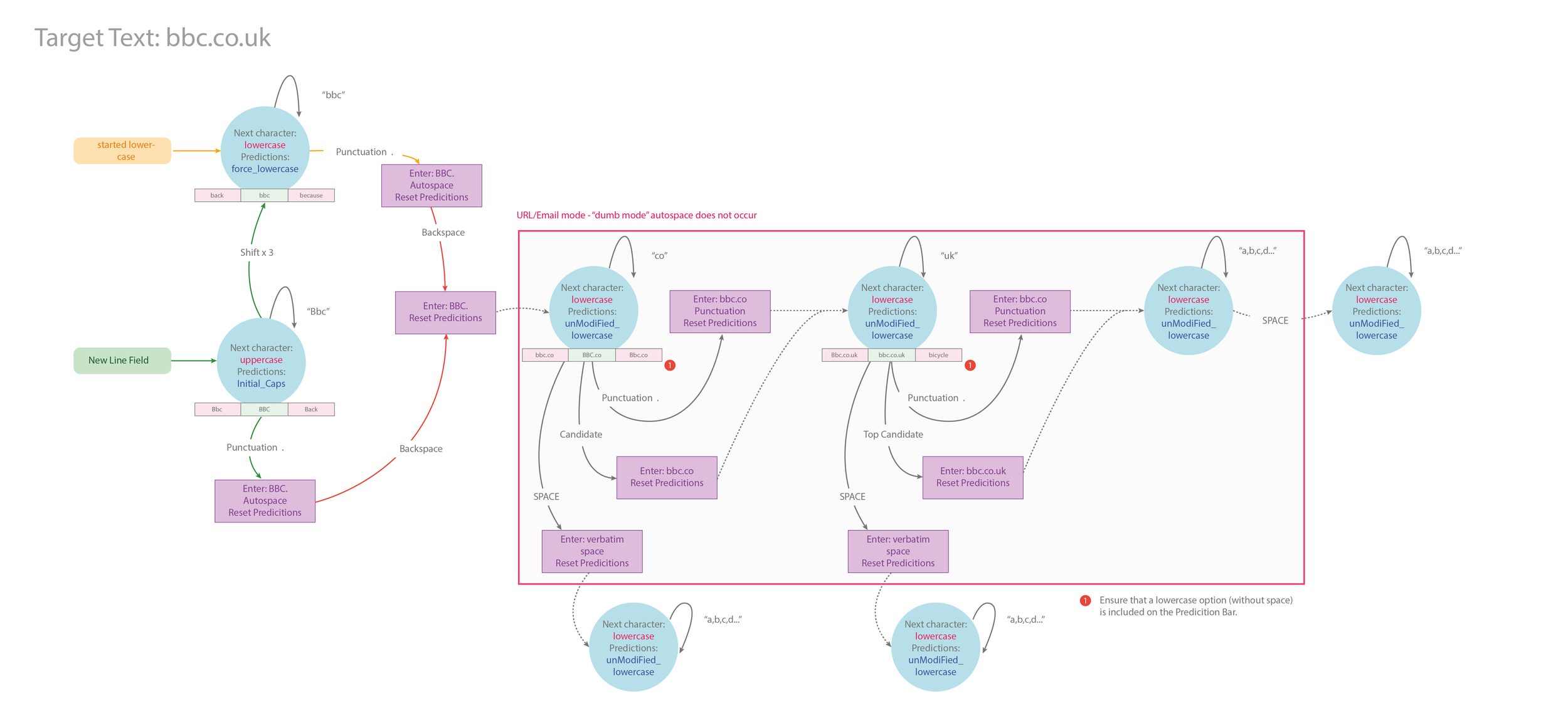
Below are some examples of the dozens of typing experience flows that I created. Being familiar with service flows and system flows, creating flow diagrams considering the micro-micro interactions experienced during the typing process, was totally new to me. Seeing the SwiftKey typing experience documented visually encouraged conversation between disciplines on how best to resolve known issues.
CONTINOUS IMPROVEMENTS
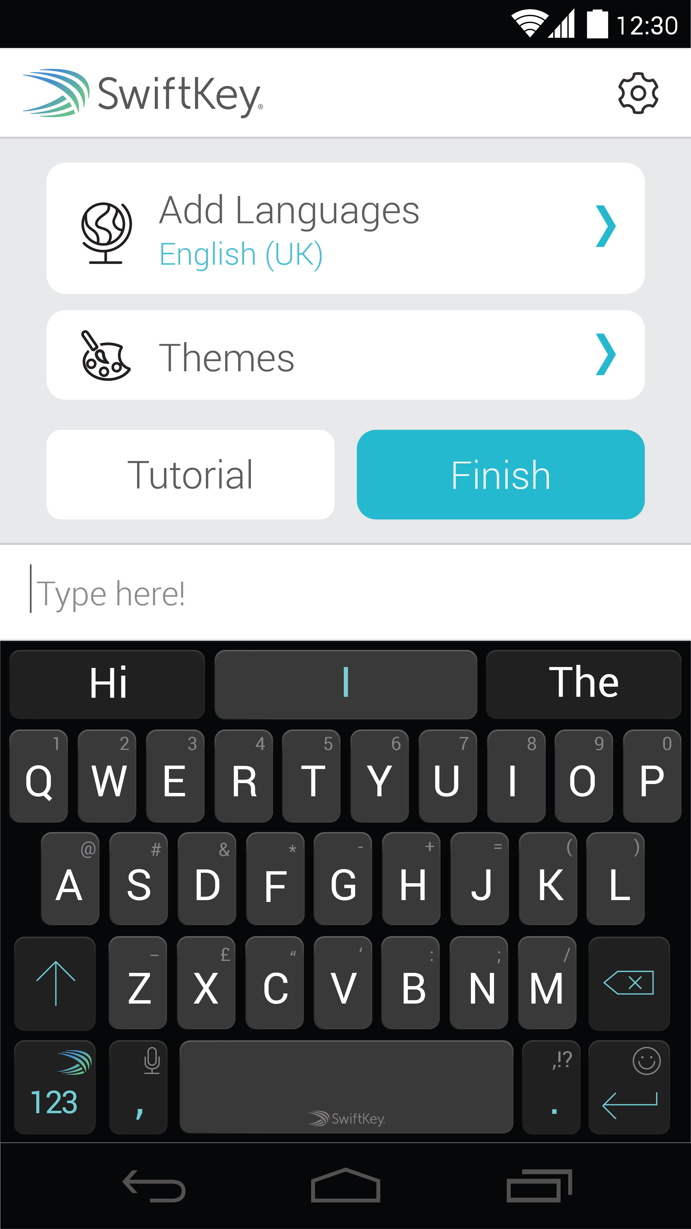
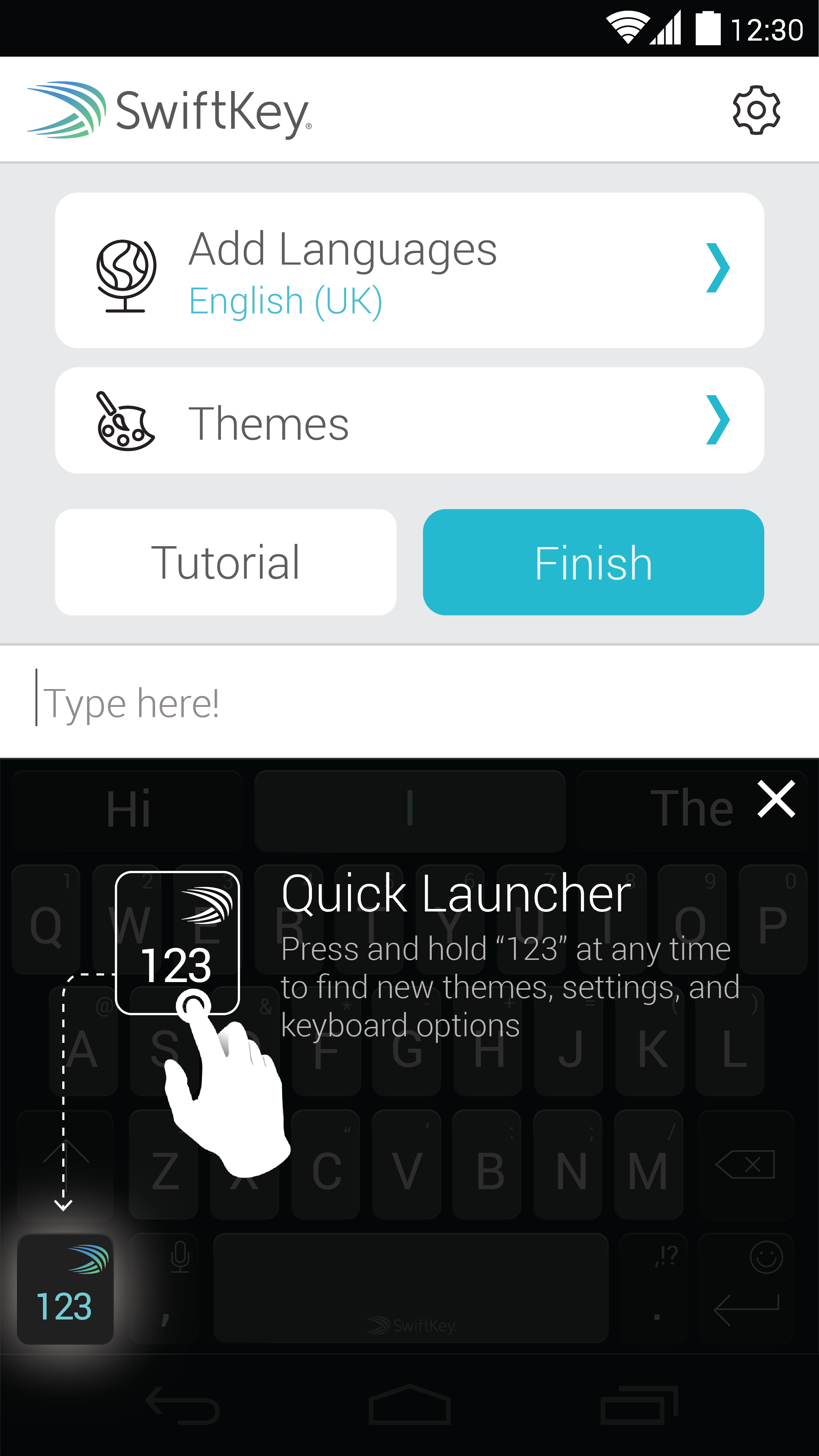
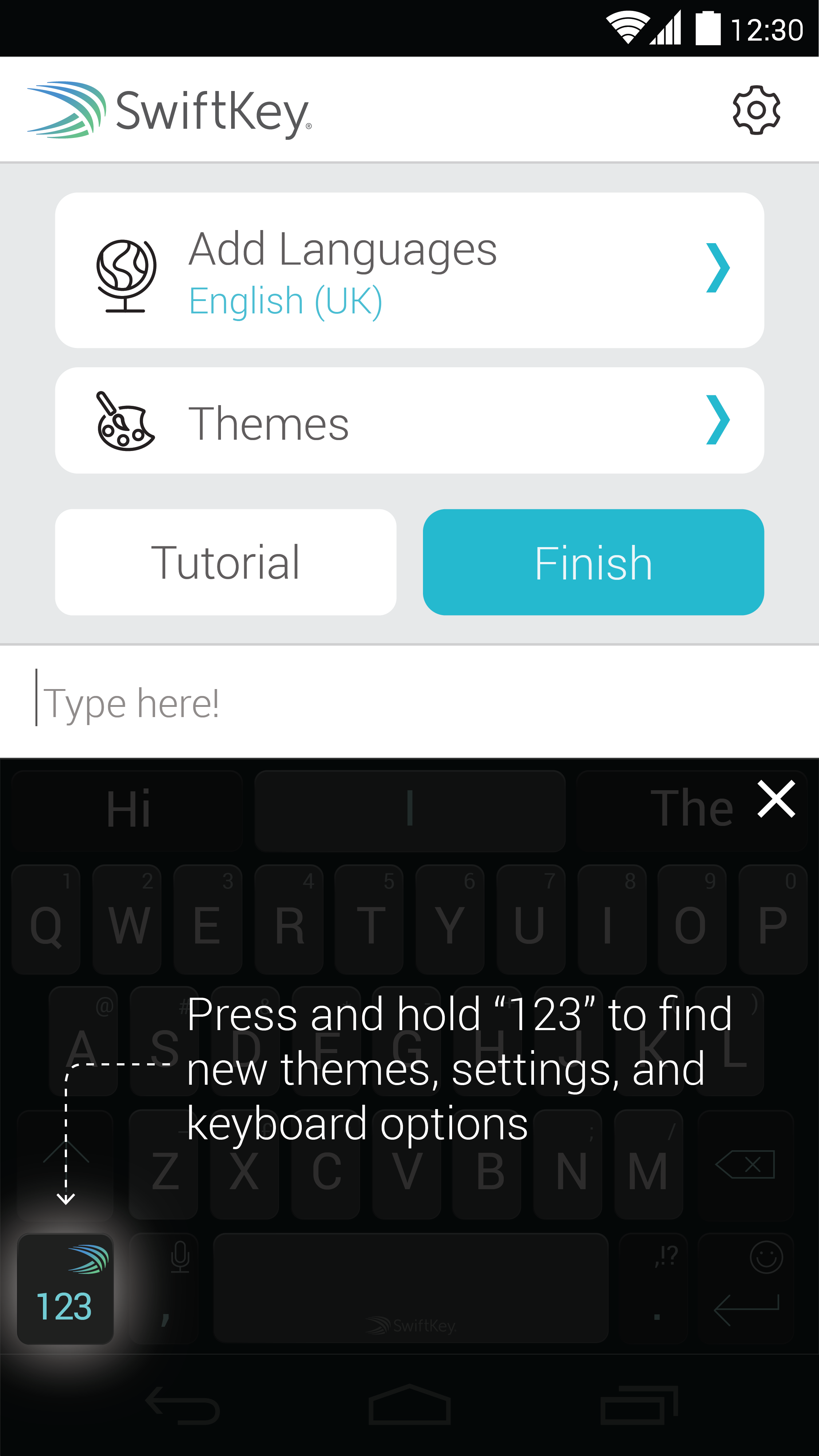
The secondary aspect of my roll involved detailed analysis of know issues, as well as rebranding, and implementation management with product managers, project managers, development teams and Head of UX. This included developing a proposed approach for a coachmarking after the initial onboarding - concept designs can be seen below.
THE OUTCOME
Autocorrect can be a blessing or a curse, and this role was all about these micro-micro interactions and scenarios - identifying key pain points on predictions and typing input, and working with the development team on the best solutions. Seeing the technical problems visualised in flow diagrams helped facilitate discussion between design and development.


